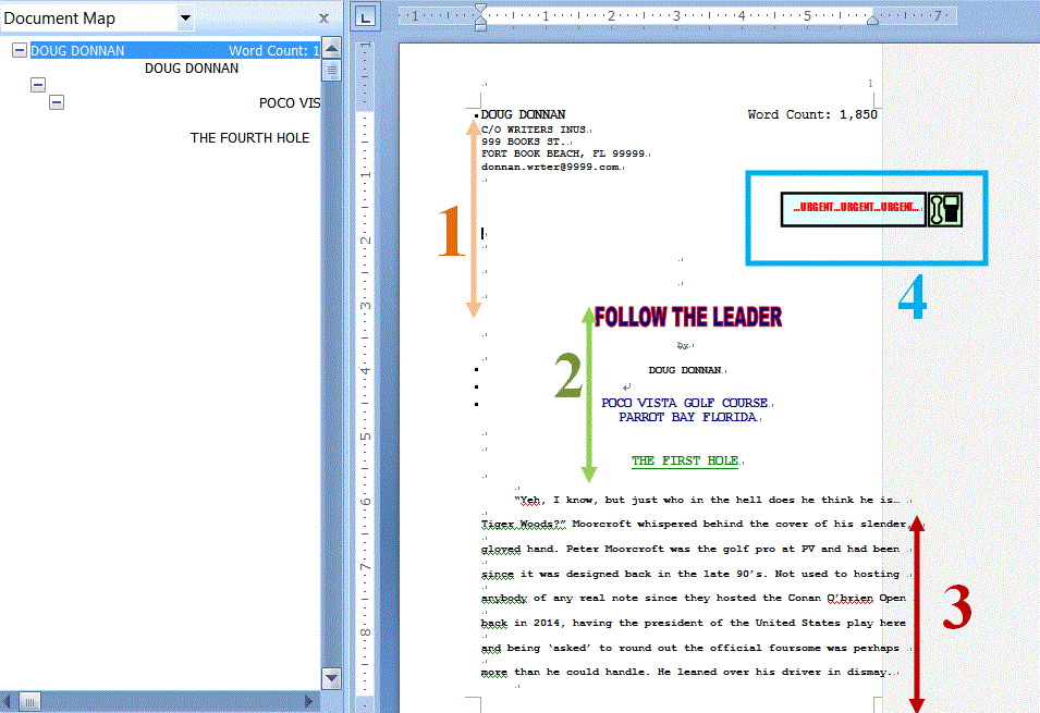
 Follow the Leader by Doug Donnan. Follow the Leader tied for first. Through the scoring processes, I gave two bonus points for format. Doug did not follow standard manuscript format so he didn't get the two bonus points. What do you think about that? Was I fair or unfair? 1. The big dots indicate an index. You can see the index to the right. Dough probably doesn't even know it's there. Word does a lot auto formatting. On it's know, this would not turn an editor off. It's easy for an editor strip from a file, however if the publisher doesn't use Word, this might cause your file to look funny. But how can you see invisible formatting?  For starters, turn on show all and you'll see what your file looks like to an editor. Word also has an inspect document feature which will check for tables, water marks... all the things you can't see. A writer should always inspect their document before submitting an electronic file. 2. Don't add color to your manuscript. This is a BIG no,no.
-- The publication has a style. Your idea of design and their idea of design probably aren't going to match. -- Reformatting means extra work for the editor. -- There is potential for conflict. Author: I wanted my title sparkly Editor: Dudes, Ducks and Donkey's doesn't do "Sparkles." Author: Well, that's how I want my story. 3. At the end of each line is a hard return. Because this story is formatted so weirdly, I suspect Doug doesn't use Word. Whatever the reason, never, ever put hard returns to create a document that looks like it's formatted correctly. If you can't create the file format the publication asks for, you could query with a short explanation why you can't format it and ask if .rft or .txt file would be okay. Some publications won't mind as long as you have a good reason, but don't be surprised to hear, "no." Selling fiction is highly competitive. Most magazines have a plethora of content to choose from. 4. Graphics. Where he put in the manuscript worked. However, I'd still advise against this. In publishing, graphics are not as straight up as you probably think they are. This graphic was actually two text boxes. To get in on the blog, I had to convert the file to a sing .jpeg and that's on top of everything I had to do get it on the blog. I spent 45 mutes reformatting this entry. Finally, my personal opinion is that despite being well placed, I think the style felt dated and detracted from the story because I stopped to wonder what year this was taking place. _____________________ Beyond format, I think Follow the Leader was a strong submission. I saw some room for improvement later in the story. But I won't talk about them in depth. Aside from being beyond the scope of critique, I don't think these things would actively hinder a sale. This is just a working theory, but I think that certain flaws don't result in "no." If the story is a perfect fit, the editor will be happy to acquire the work. I think the only time these little things matter is when the editor is deciding among a selection of possible yeses. Beyond that, there are other elements completely out of the author's control. Critique groups make us feel like we can overcome these things, but in truth we are always at their mercy. For example lets say this story was formatted perfect. Follow the Leader still might be a hard. There's not a lot of magazine publishing this kind of tale. That's why formatting with a story like this is super important. There are fewer markets who buy this style, only X chances to make a sale. I appreciate Dough letting us take a look at his story. I know that this will help other writers down the road. ps I learned my own lesson about this when I put footnotes in my story, Meat Head, The Worst Dog in the World. Comments are closed.
|
Categories
All


Archives
May 2022
|
 RSS Feed